Sketch noting
What are Sketchnotes?
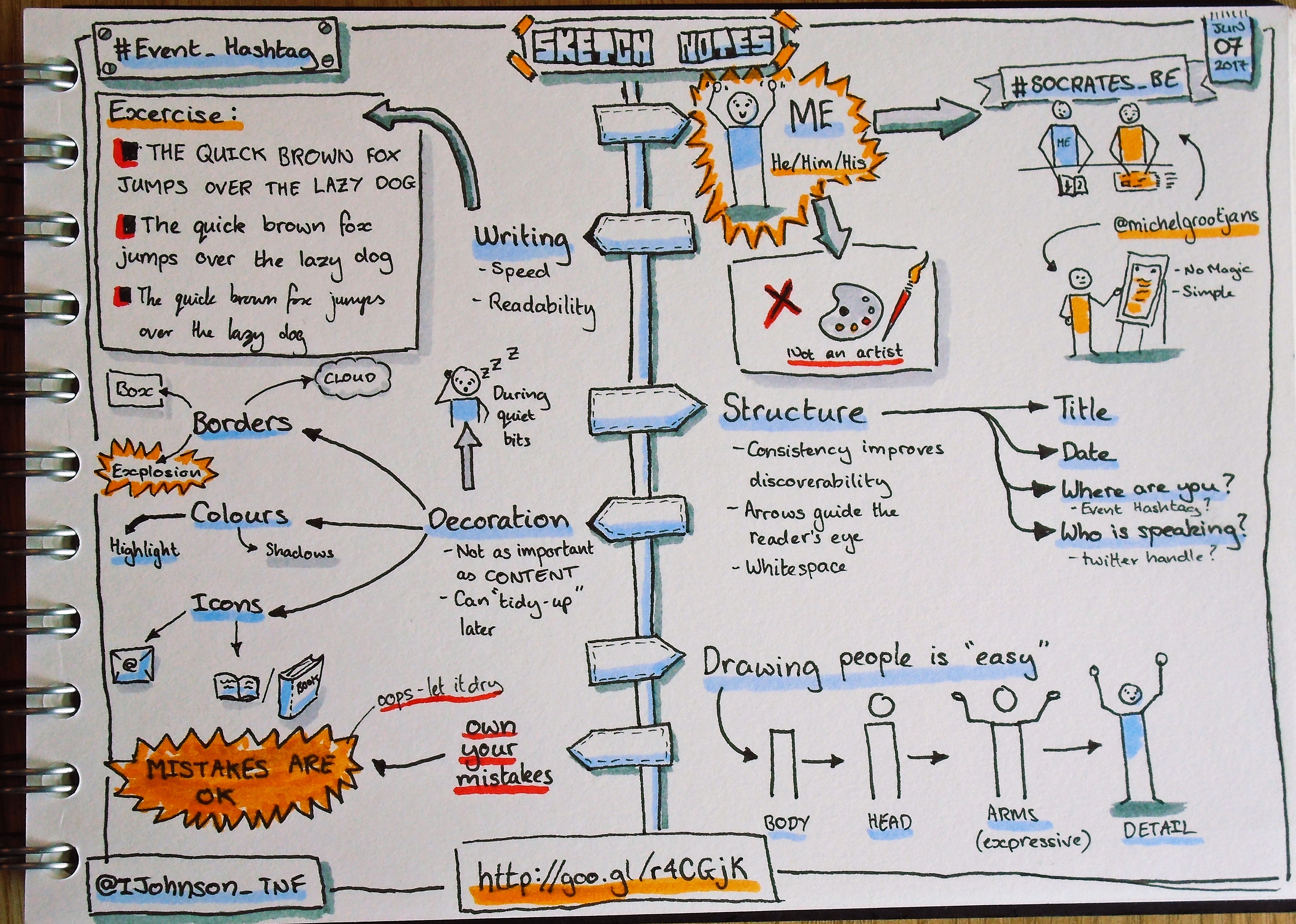
A Sketchnote is a way of visually taking notes and structuring the information for discoverability. This is not about capturing every detail that is presented but providing an aide-memoire, something to jog your memory and take you back into the event.
My inspiration
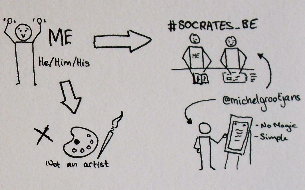
I was at the SoCraTes Belgium conference and was impressed with the notes @michelgrootjans was taking. My own notes were scribbled down and all over the place, compared to Michel's there was no structure to them and they were not as easy to scan to get the relevant information back out.
There were many others who were also impressed so on the second day of the conference he ran a session showing us some simple techniques, most of which I'm showing here.
I came out of the session with the confidence to change how I laid out my notes, even with the same pen that I was writing with before I changed how I wrote my notes. I will stress that you do not need to buy new pens to start sketchnoting, I spent some time just with my normal pens before I did my usual thing (I bought all the tools... fineliners pens, watercolour highlighters etc).
Writing style
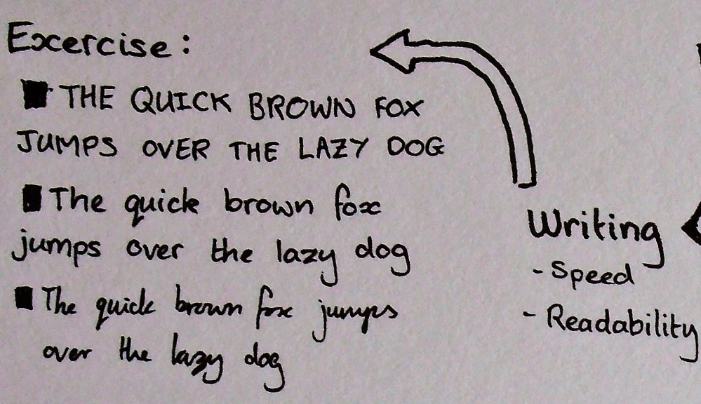
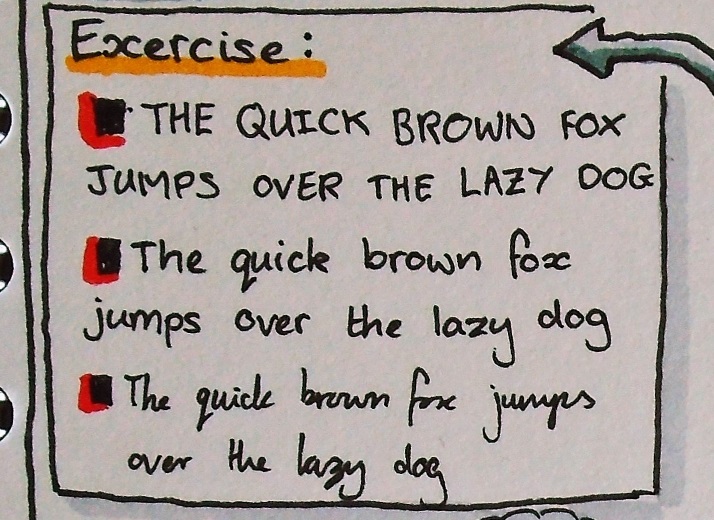
Sketchnotes are all about the content and although there may be drawings and arrows in them there is likely to be a lot of writing, so you want it to be clarity, consistency and readability at speed.
The exercise described above is to keep repeating the same sentence that uses every letter in the "English Alphabet". Simply try this out many times, try writing in ALL CAPS, Mixed Case and even Cursive to find the style that gives you the readbility that suits you.
The consistency means that things you emphasise by increasing the size, colour, or weight of the text.
Structure
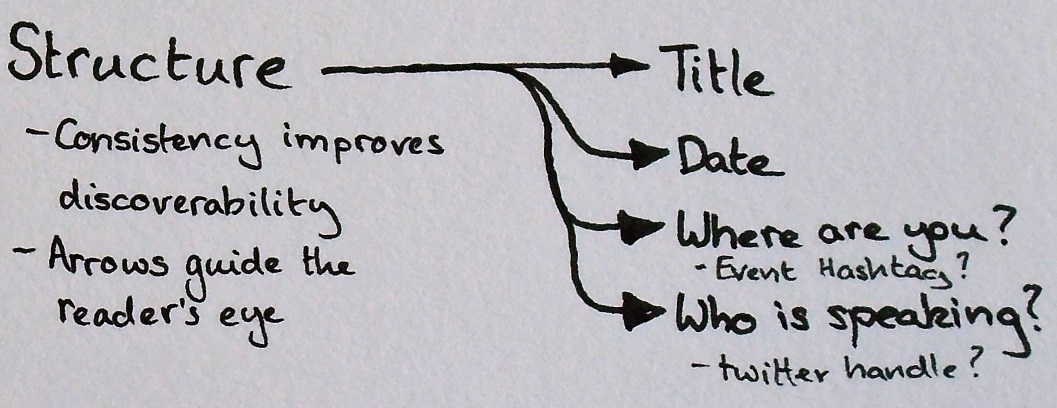
When creating a sketchnote I want it to be discoverable. I tend to add the following elements to the page:
- The title is normally at the top-centre of the page. I like to make it something that stands out, more than just writing the title
- The date of the event/talk that I am sketchnoting is usually on the top-right of the page and I design it to look a bit like a day calendar.
- The event is usually represented by the event's hashtag in the top-left corner of the page.
- The speaker, if there is one, I represent in the bottom-left corner of the page. I usually use the speaker's twitter name.
These are things that I normally add to the page by default, I tend to get to the room a few minutes early, get settled down and add them to the page while everyone else is arriving (and the initial introduction by the speaker).
You can easily add structure to your documents by using arrows, to guide the reader's eye from one piece of information to the next.
The rest of the page is up to you. All you have to do is make the first mark, just start somewhere, there is no right or wrong place to start.
Decoration
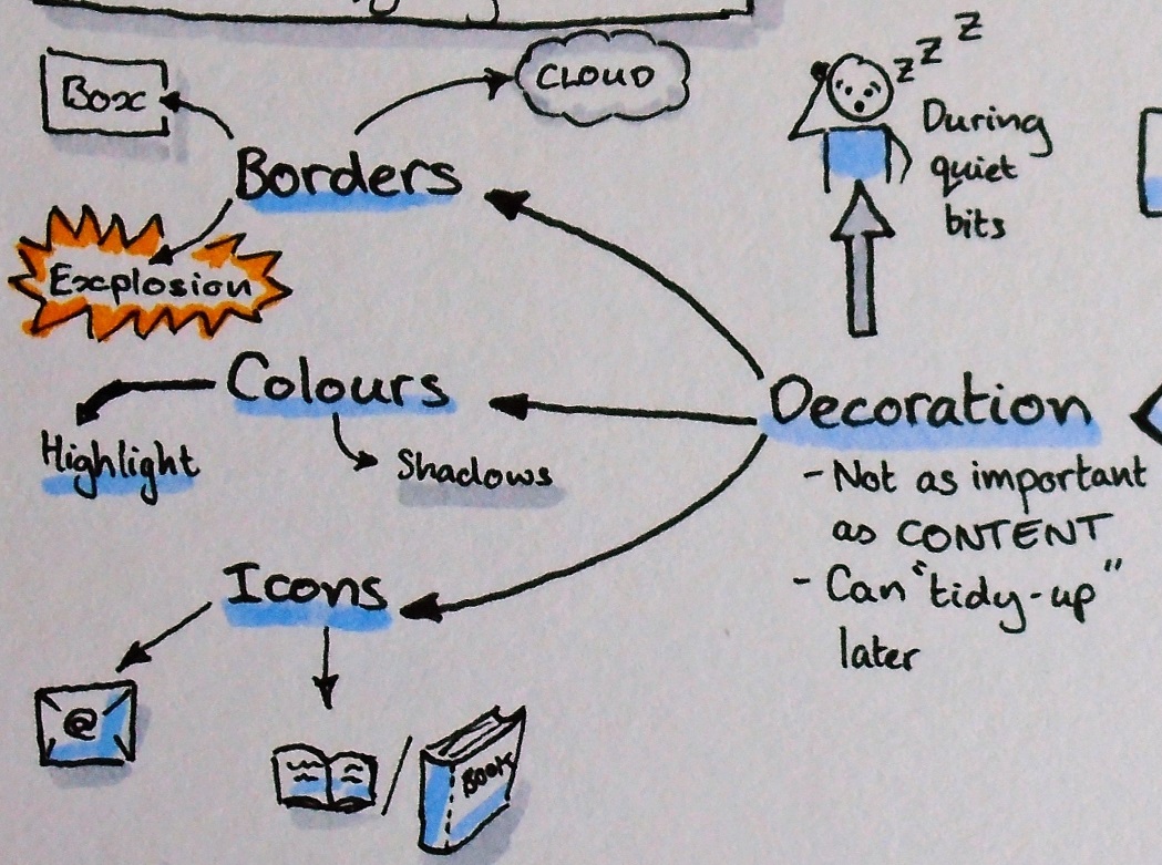
It is the decoration that brings the sketchnote to life but the decoration should always be secondary. If there is a lot of content, you are focussed on listening and summarising the content of the talk then you should not be focussing on decoration, but you can come along later and add the decoration in your spare time.
I don't necessarily follow any rules when decorating, I do what "feels right", but I try to keep it simple to things like:
- Borders that contain related content. Usually restricting myself to boxes, clouds and explosions but I have no real rule as to which I use.
- Colours allow you to highlight the most important parts and to provide depth, I tend to add drop shadows in grey to the borders etc. Try to keep a limited palette to prevent your notes from becoming too "noisy".
- Icons and sketches can say far more than words sometimes, but they have to be fairly simple and quick to draw.
I typically use a book icon next to any books that the speaker references, as I scan through the pages I can easily scan through to find my next book to read.
Drawing people is "easy"
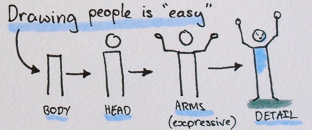
It is fairly easy to create simple, but effective sketeches of people, retaining the same basic body shape a lot of expression can be added in the arms and in the facial expressions. All it takes is practice.
Own your mistakes
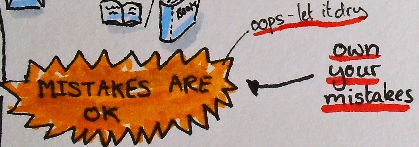
We all make mistakes and even though I publish most of my sketchnotes there are some that I do not because they contain the wrong information, or they are just a mess. I know that I should publish some regardless but there is still a bit of the perfectionist about me. However, I'm willing to try, I try different techniques and I sometimes make mistakes but they are only notes (mostly for my own benefit) so even if things go horribly wrong I can still gain some value from it.
Turn a mistake into a feature
In the picture above I made a mistake when writing the first sentence, I didn't like the size, or the position of the first 'T' but I coloured it in and made a feature of it by making a similar block for each of the other sentences to turn it into a bullet point. I made a feature of the mistake and hopefully, if I hadn't pointed it out no one would notice.
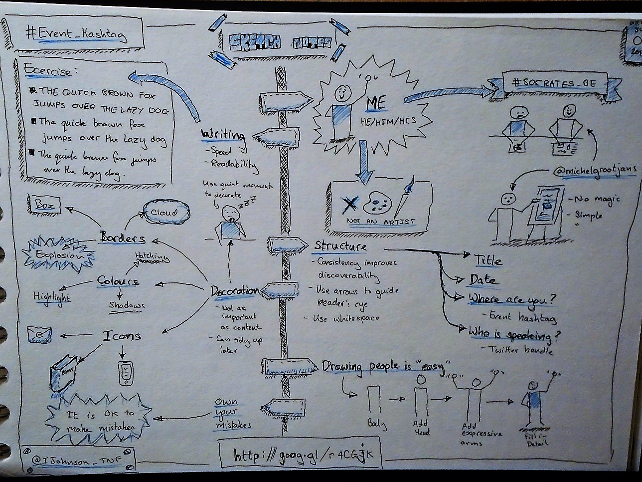
The final product
This is the final sketchnote for this talk, with everything put together, I have shown how you can build this up, piece by piece. There is a high-resolution picture of this and just for comparison here is a version I made using only two coloured fountain pens:
Resources
Note, you do not need much to start, using simple techniques and a few ordinary pens (one main colour and one highlight colour) you can create impressive sketchnotes. However, if you want to do more, then here are some resources for you.
Pens
Text/Drawings
For writing I tend to use a set of pens that have ink that doesn't bleed into the page and is waterproof (once dry!) as when applying the colour the ink may run from other pens:
- Staedtler fineliner markers are my "go to" pens for this
- Pigma Micron fineliners are a good alternative.
Colouring
The colour is for accent, it does not want to dominate, so often I am looking for something in more pastel shades, more like a watercolour pen, here are some of my favourites:
- Neuland pens are what I currently use, they are refillable and have replacement nibs so I can maintain them well (though never had to!). My preference is for the brush tips as I get to easily vary the line width but that can come back to bite you.
- Letraset Aquamarker are good because they come with two different tips so giving you more control for the same price
Notebook
I look for a plain notebook with a decent weight to the paper so that the inks and colours do not bleed into the paper or bleed through as much. I go for A5 mostly for the convenience of carrying around. Currently I'm using this notebook.
More information
- 101: The basics of visual note taking
- The Sketchnote Handbook: The Illustrated Guide to Visual Notetaking by Mike Rohde
- Bikablo provide resources for visual notetaking